Rebranding for SR22 Insurance Now
California-based insurance website redesign that boosted leads by 40%
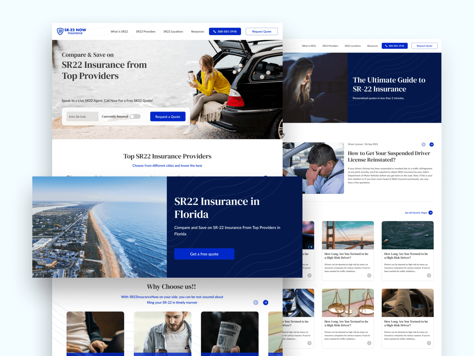
Understanding the Challenge
The client’s insurance website felt cluttered and outdated. Users struggled to navigate, the structure was unclear, and the design lacked the credibility needed in a trust-driven industry. Their brand identity was also inconsistent, which weakened trust and recognition.
Additionally, the website failed to communicate the company’s value proposition effectively. Key information was buried under poor layouts, the call-to-actions were weak, and the overall experience did not reflect the reliability customers expect from an insurance provider. This gap between user expectations and brand perception directly impacted lead generation and customer confidence.
Our Approach
When we first reviewed the website, it was clear that small tweaks wouldn’t be enough—the problems ran deeper than visuals. We started by stepping back and asking the right questions: What do users really want when they land on an insurance website? and How can the brand project trust at every touchpoint?
Our discovery process involved competitor analysis, understanding user pain points, and mapping the customer journey. From there, we rebuilt the sitemap to create a logical, intuitive flow of information, ensuring users could quickly find what they needed without friction.
Once the foundation was clear, we moved into design. We focused on a UX-first approach, stripping away clutter and simplifying navigation. The UI was then layered on top, with a modern visual language—clean typography, consistent colors, and modular layouts that made the site easier to scale.
At the same time, we worked on refreshing the brand identity. The old branding lacked consistency, so we introduced a more cohesive palette, refined imagery, and a clearer voice. This ensured that the website didn’t just look new, but also aligned with a stronger, more trustworthy digital identity.